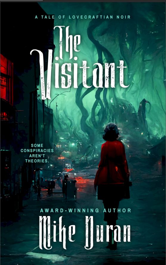
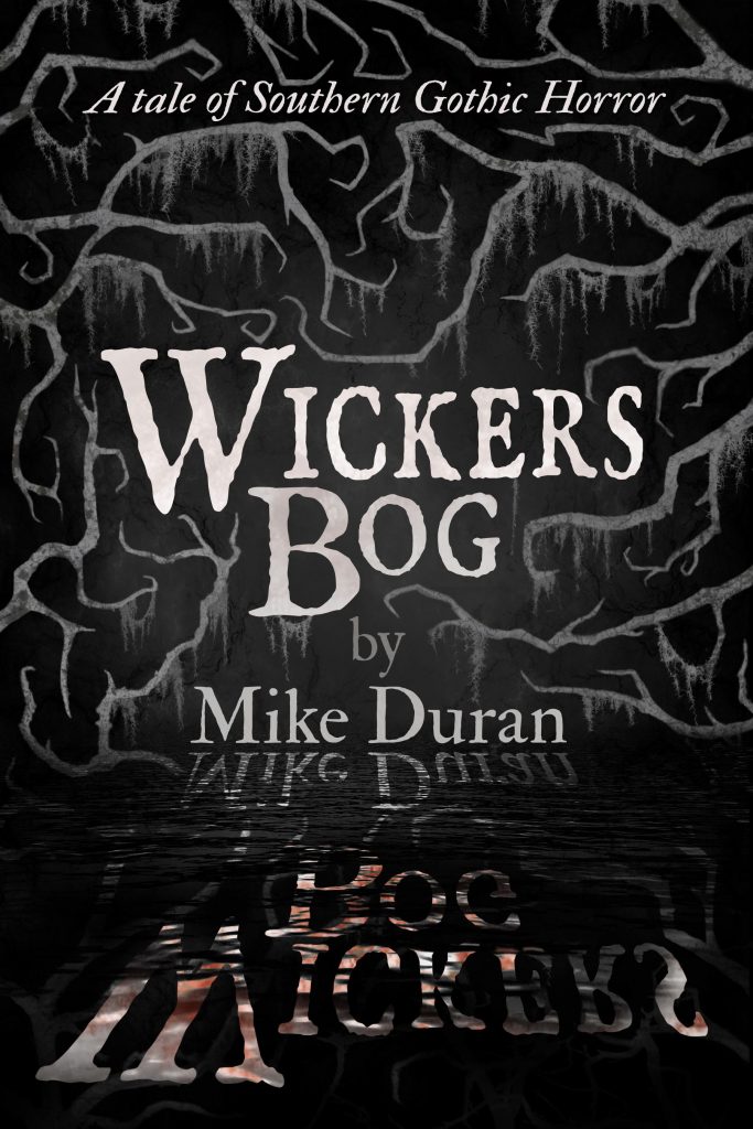
I recently took my first peek at the cover design for my debut novel and, when I saw this title font, about fell off my chair. Gotta say — I love it!
“The Resurrection” Title Font
Next post: The Myth of “Secular” Fiction
Previous post: Praying With Your Eyes Open




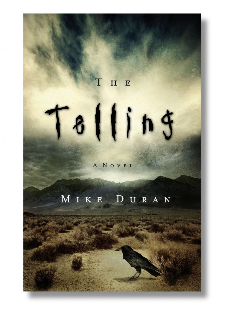
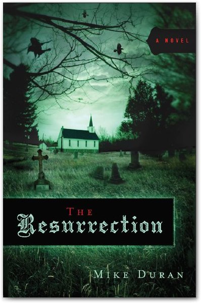
Nice font! I’m wondering why the “the” is off center? Or did they center it between the R and the T and not the whole word.
Jay, this is a first draft. I made some observations and suggestions, one of which had to do with the title positioning. At first, I thought the font seemed too Gothic. But after a few looks, I really liked it. So I’m breaking out my black eyeliner and knee high steel toe combat boots in celebration.
Cute, Mike. 😈
And I like the font too. I am looking forward to when I can get my hands on your book. 🙂